
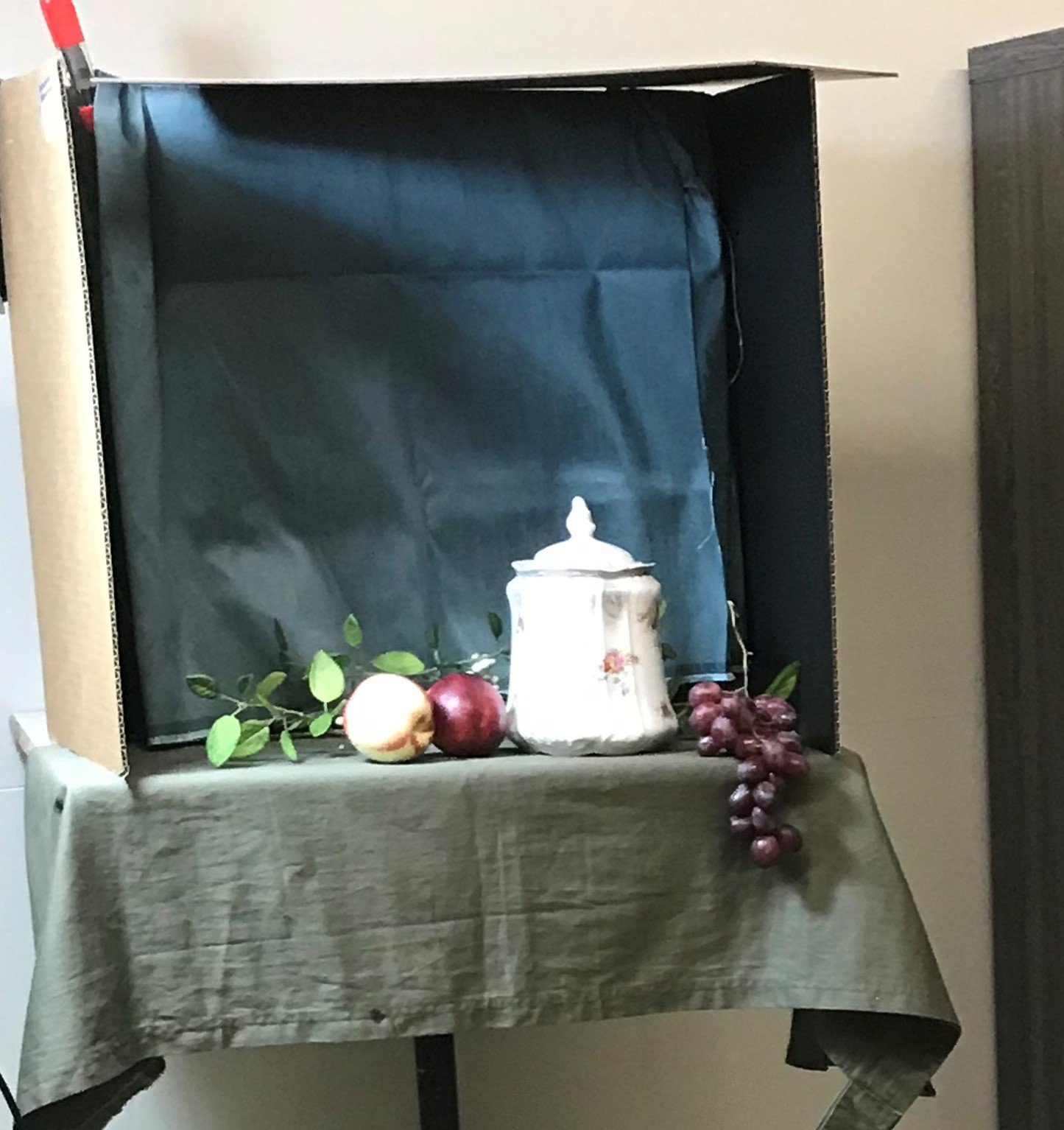
The Set Up!
The arrangement is a beautiful French Limoges Porcelain Jar, this will be the main event! I paired it with some gorgeous nectarines, grapes and artificial leaves. I decided to go with a blue green background as I thought it would be a nice complement to the reds and pinks in the jar and fruit, but also harmonious to the greens and blues in the foreground as well. I really liked the thought of these dancing spring greens leading you up to the main event.
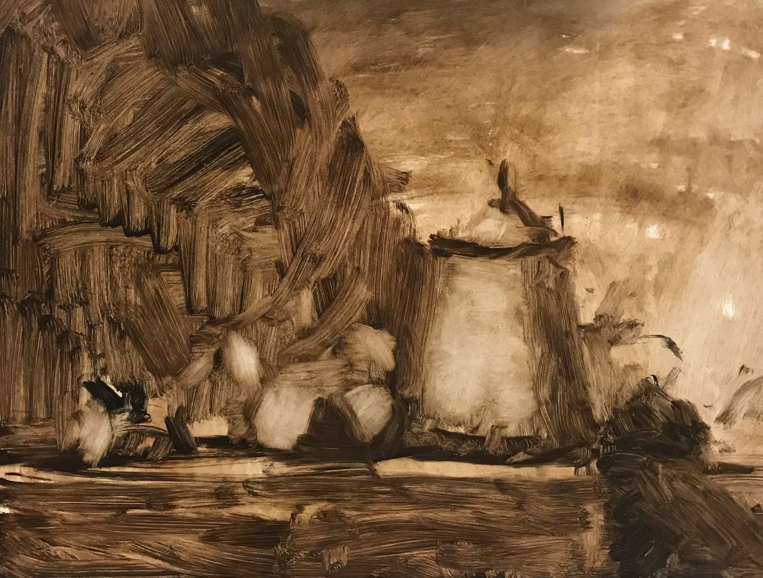
The Start
I toned with burnt umberr working on a beautiful non-absorbent Ampersand Gessoboard.
I mass in the most important thing first, the porcelain jar. I separate the light shapes from the shadow shapes on the jar.
I move to the smaller objects like the nectarines, they’re perhaps next important in line. I make sure I don’t make them too big in comparison to the jar. I put in suggestions of placement for the grapes and leaves, but I leave it fairly open ended – possible to change around – not being too committed right away.
I put in some more umber darker for the background shadow and table edge. I should have 3 values present now in this monochrome start.
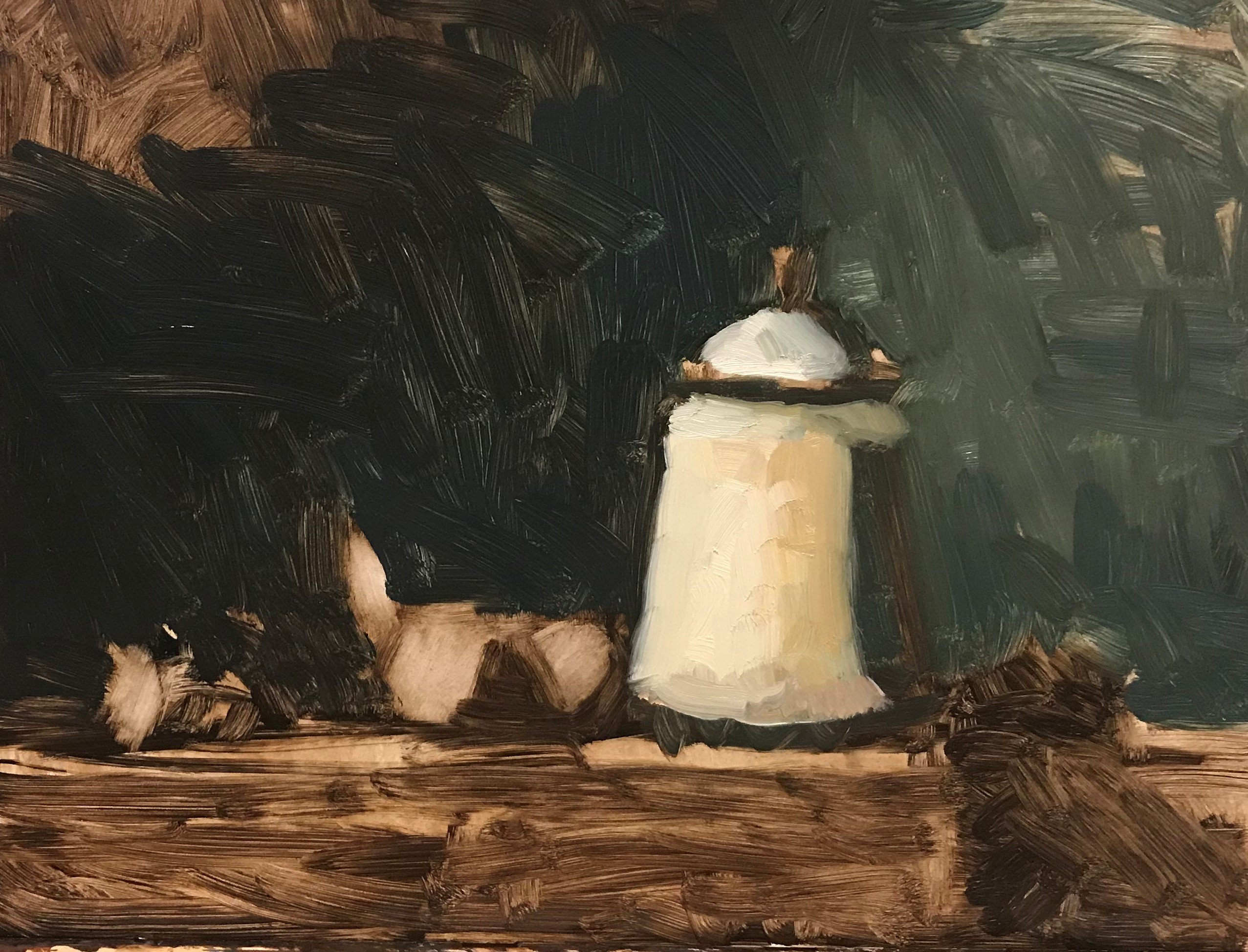
Background
I put in some shadow and light background color.
Shadow: Raw Umber, Ivory Black, Prussian Blue.
Light side: Raw Umber, Ivory Black, Prussian Blue Naples Yellow and White
I’m careful not to “finish out” my background and in fact I don’t really touch again until the very end. I need enough of it in to correctly judge other values and especially around my main objects.
To start the light on the vase I use Cremnitz White + Prussian Blue + Cadmium Yellow Deep.
Boy does this look ugly right now – ha ha. A big issue I see for artists is trying to make it look good and perfect too soon.
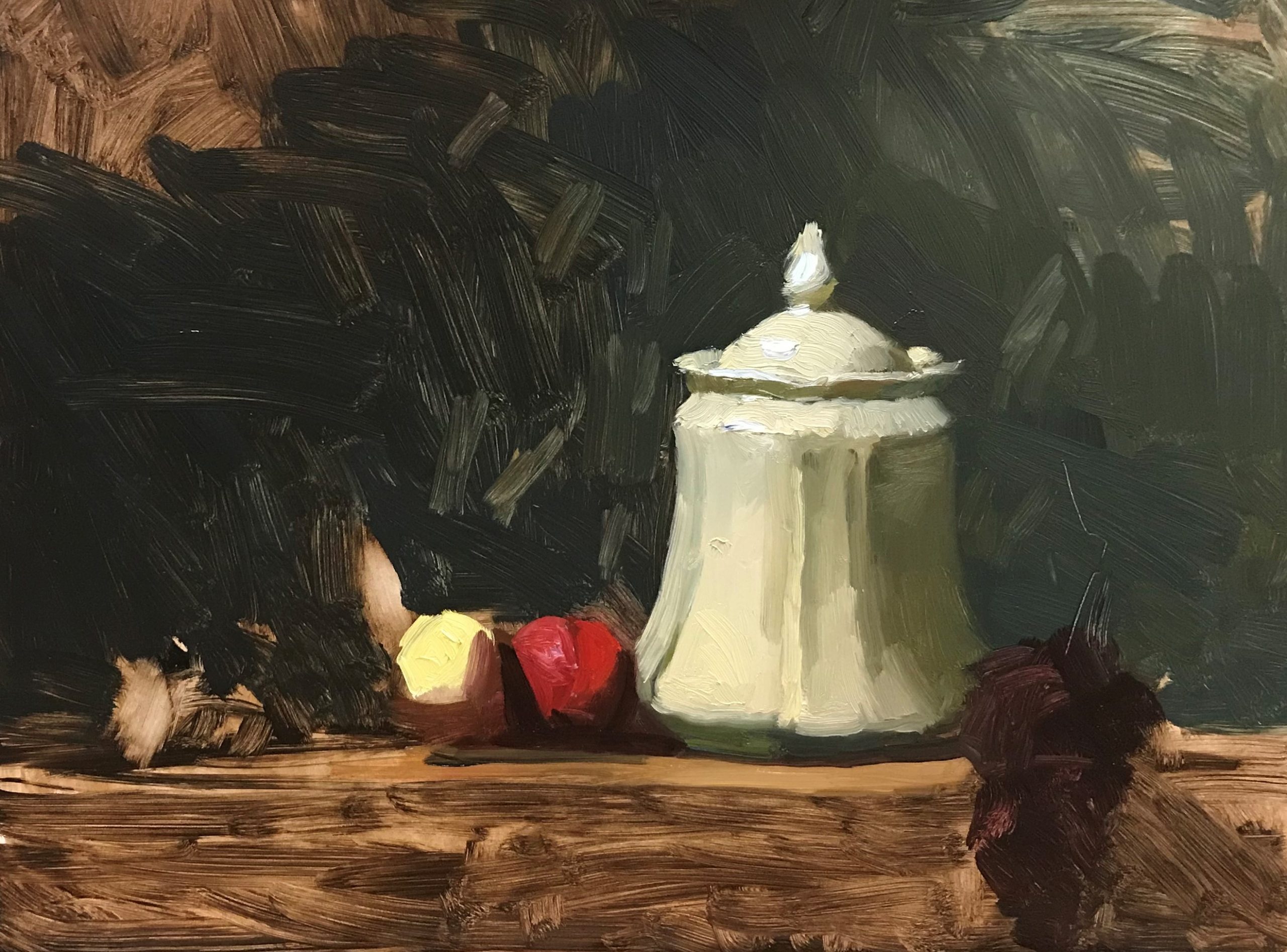
Building Color.
Next I begin to build some pure color on the nectarines. One is more yellow and one is more red. I mostly use Naples Yellow on the left one and Cadmium Red on the right one.
I then put some Ivory Black + Alizarin Crimson in for the grapes leaving them unresolved and rough still. I won’t know how much detail to do on these until the rest is put in. The grapes act as a light stopper in the painting and holding the eye in, so if I were to put a bunch of color and detail they would attract too much attention.
As you can see, I model a few more details on the jar. I place some highlights in the right places, try my best to indicate the fluted edges in the porcelain (this is a toughie). I studied the jar closely to see which parts of the jar where getting lighter. One those parts I put more warm yellow white and on the parts that dipped away from the light source I used my background color to cool off and gray down. The value and edge transitions at this stage are certainly rough, but they will smooth out with more working.
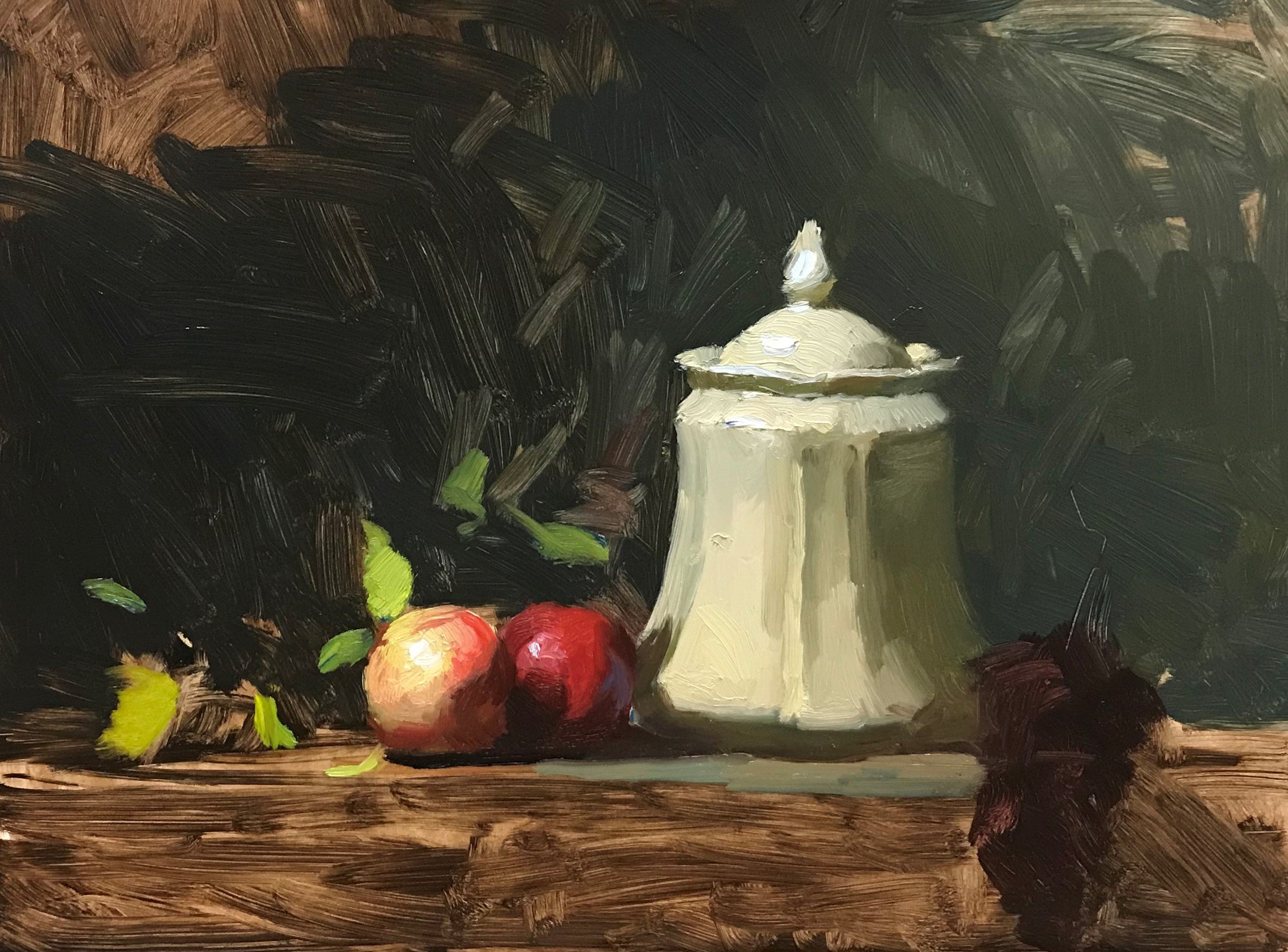
Modeling Nectarines and Leaf Color
I start to build light with a top central highlight on the yellow nectarine. I start adding in some cadmium red light on this one too as it rolls over to the darker nectarine.
I want to see now what this beautiful yellow green (cadmium lemon + Prussian) is going to bring to the party. It really starts livening things up! I focus on the ones closer to the nectarines, making them the brightest and crispest edges. The others I try to tone down a bit (less yellow), keeping the edges softer for now with the main goal being leading up to the jar.
I decided in this stage to make the shadow side of the vase lighter in value than the background and warmer with some ochre to give it some glow. I also start putting in table top color, mostly a lighter background color with some warm variations. I place some warm and cool reflections into shadows where I see them.
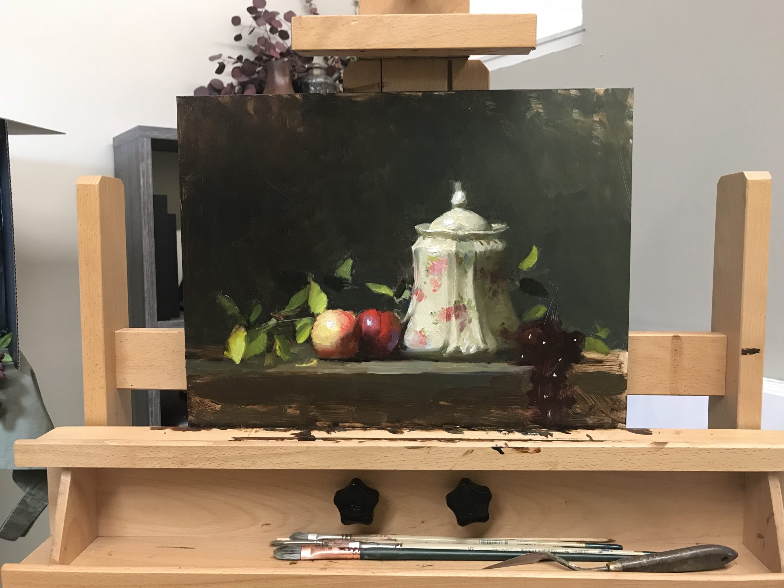
Fine Stage: Pattern
God bless that pattern on the jar because without it this would have been a pretty boring painting.
Using a smaller brush (2) I begin adding in some pinks, reds, purples and greens. I concentrate on the front center being more in detail and more colorful. I make sure to lighten the pattern and blur it a bit around the highlight. On the shadow side I put in the dark accents of the pattern. It’s important to observe the pattern of the light moving across the jar in this stage, not just the pattern of the jar.
I smooth out my background a bit, polishing it up, which makes it recede in relationship to the objects.
I work more on the leaves getting them to follow through all the way to the grapes. Light reversals are so important on these, so I choose which ones I want to be more lit up and harder edged carefully. I see them as abstract shapes more than leaves and I change their value lighter or darker as is needed for the painting.
At some point I had more detail on these grapes, but I went back to just a simple mass with highlights. It just worked better being simple and suggested. There are times when you must restrain yourself from putting in more details if it better serves the beauty of the picture, even if you “know” how to do something really well.

Final Results
This was an alla prima, one day, painting. I was satisfied with the results, so I did not go back to it again. It went on to a show and found a new home gratefully. Remember a painting doesn’t have to be perfect to be beautiful, it just must have a beautiful story with intent.
P.S. Paint with me for five days, February 8th – 12th, during my 5 Day Still Life Painting Workshop Online! Click here for information: https://artlifewithkelli.com/product/5-day-still-life-painting-online-workshop-with-kelli-2021/.


2 thoughts on “Painting Limoges Jar and Nectarines 12” x 16” Oil on Panel”
Thank you so much for sharing! I will try this one tomorrow!🎨❤️
Thank you so much for this,Kelli. It was so clearly explained! I would love to study with you but not financially feasible for me. I try to learn what I can from your generous sharing. Maybe one day I can be in one of your classes.